Recently, I found a old Thinkpad T40 for around 10 bucks at the Thrift Store. I’m always a sucker for Thinkpad’s so I picked it up.
I’ve already got a Thinkpad T41 which has made for a fairly competent Windows XP laptop. This one has less RAM installed (512MB instead of 2GB) and a slightly slower processor (1.5Ghz versus 1.6Ghz); and in the interest of variety I opted to install Windows 2000 on it.
It had no Hard drive, but I have a CompactFlash to laptop EIDE adapter that I never got to work properly in the T41, since it was always detected as a removable drive which caused problems. Since I had no other options I tossed that in and installed Windows 2000.
My first problem was that the machine had a Supervisor password; once I added the Adapter, it detected a hardware change, required entering setup and saving; without the supervisor password, I couldn’t actually POST.
Unlike a Power-on password, the Supervisor password is actually stored in a EEPROM chip. Having nothing to loose, I cracked the system opened and checked a few datasheets for the smaller EEPROM-like chips. I found an ATMEL chip, situated on the motherboard right under the touchpad, which looked the part. I started shorting pins and turning the laptop on. Several gave me POST errors, but one eventually gave me a “IAIA Data Access Error” and after restarting, the supervisor password was gone, and I now had access to the machine.
Installation went smoothly, but installing Office, and then Visual Studio, hit snags because of the detection as a removable drive. Office 2000 would, halfway through it’s install, seemingly seek for the drive it installed to and assume it was the first non-floppy removable drive, so it was trying to install from C:. I was able to trick that by copying the CD contents to the Compact Flash card, but Visual Studio 98 was more insistent and refused to install at all. It seemed clear I needed a solution to this problem, so dug back into my research on the subject.
I tried a number of utilities to resolve this, but unfortunately I couldn’t find a way to flip the bit on the card itself. However, I did find the Hitachi Microdrive driver, changed the INF file to add the CF Card’s device information, and then “updated” the driver for the drive using the INF. after rebooting- it was a fixed disk drive- Victory! I was able to install programs without getting weird roadblocks thrown in my face.
Once I was using the OS proper, It was almost refreshing how straightforward it was. I didn’t get advertisements for Onedrive shoved in my face. I didn’t get presented with 500 different privacy settings, with dark designs intended to coralle me until choosing the option that sends extra data to Microsoft.
It occurs to me, that this really should not be how it is. I shouldn’t enjoy using these older operating systems. They should feel archaic and broken; like trying to use CP/M when Windows 2000 was contemporary. And yet, using Windows 2000, I actually feel like *I* an in control of the system, whereas- until I take extra steps to assert control- is not the case with Windows 10 (or 11)- with those Operating Systems, I rather feel more like a passenger capable of making suggestions to the driver.
And the User Interface is, frankly, better-designed. The old “3-D gray” style visuals from before Windows XP (or from the classic theme, if you were into that on XP) really were a straightforward Interface. They were considered “eye candy” themselves, back when they were introduced to Windows with Windows 95, but somehow they’ve been relegated to just “looking old” now, in deference to random swishy burger menus and fancy acrylic blur and stuff. With Windows 2000, There are fewer stylistic design choices adding noise to the environment.
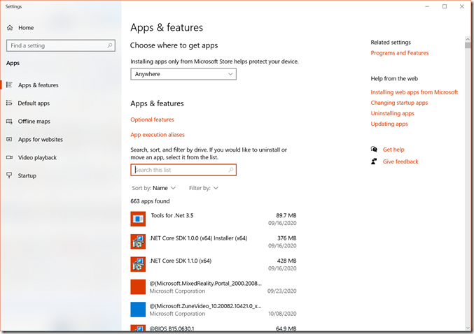
A simple comparison can be done. This is the Windows 10 Add/Remove Programs window:
This window is 1866×1316 pixels in size. Notice how I can only see 6 of the items in the list. Some of which frankly make no sense. What is @|Microsoft.MixedReality.Portal_2000_2008… supposed to mean to me, as a user? I don’t know what that is. I can guess it’s related to Microsoft’s Mixed Reality Portal, but why doesn’t it have a better description?
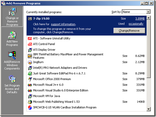
Compare that to the Add/Remove Programs Window from Windows 2000:
This window is much smaller, yet I feel it uses that space more efficiently. I can see more of the programs that are installed, there’s more information available at a glance (eg. many of those names would be cut off if presented in the windows 10 version), and frankly it just feels better designed. The Windows 10 “App” version always felt rushed and that the design was just “make a way to add/remove programs that’s an app” instead of reimagining the process, they just sort of ported the old Win32 implementation very poorly.
Of course, I’m not the first to compare these new implementations to the old. Nonetheless, I feel that somehow, function has started to not just take a backseat to form, but almost been relegated as a side bet. First and foremost, apps must look nice. with fancy, storyboarded animations for things like their all-important “hamburger menu”, and if they can do what they are designed for, hey, that’s a plus. They seem to have specific, predefined layouts, and make elements very large, which produces very low information density.
Consider Windows 11. The Taskbar featureset has been indisputably pushed backwards. hovering dragged items over taskbar buttons no longer activates the button, you cannot move the taskbar to either of the other three sides of the screen, neither small icons nor visible labels are supported, and the default is to center everything. Some argue that this is because it was rewritten. And yet when they “rewrote” the taskbar they saw fit to rewrite the code introduced in Windows 95. that handles DDE messages sent to the PROGMAN window class in order to be backwards compatible with Setup programs that add program groups to Program Manager in Windows 3.1. Seems like if that is so they ought to have spent those resources maybe adding some of the other myriad of missing features people actually want, not backwards compatibility features from over 20 years ago; chances are, however, it’s not a rewrite; or not a rewrite of the entire thing, which just raises more questions about why those missing features were removed.
A lot of work had gone into the design of desktop operating systems over the years. Early on, the Mac OS introduced a new concept of sub-menus, where pull-down menus could themselves have drop-down menus. This was somewhat controversial in terms of UI design; To quote from an editor’s Note in “The Macintosh Bible, Third Edition” – “I hate hierarchal menus—they’re cumbersome and slow. But that’s what makes horse races —AN” I’ve always found it fascinating how carefully some of these features we now take for granted were designed, only to be replaced by what I would (uncharitably, mind) call migrating the untested, thrown together user interfaces of “web apps” into a desktop interface, replacing those well-tested and regarded implementations.
Under no circumstances on a desktop or laptop machine is the “hamburger menu” approach taken by mobile-styled applications superior to the traditional menu bar/tool bar design. the entire point of the hamburger menu is to preserve real estate, while still providing large touch points for interaction. Desktop and laptop computers have never needed that.
Nothing about the direction that user interface design has taken for desktop and laptop machines over the last few years leads me to look forward to future developments, because from where I’m standing it’s a bunch of children refusing to learn the UX lessons of the previous generation in preference for whizbang poppy animations and other derivatives of flashy internet interfaces designed to attract attention not to be usable.
Have something to say about this post? Comment!


