
When choosing a font for any situation, you must consider the context of the font as well as it’s readability. Choosing a font for programming work is no exception. However, for the most part, programming fonts are blocky, and rigid; much like the source code they are used to display. Traditionally, Monospaced fonts work best; I know people who use MS Sans Serif and it drives me nuts.
I’ll skip the prologue involving the TX-1 and PDP-1, PDP-7, and so forth. Let’s start with the first Personal Computer- the IBM PC. Naturally, this machine didn’t really have a concept of “fonts”. usually, any editing of text you would do- programming or otherwise- was done using the “System” font. This actually varied between systems. Typically, the font was actually stored in the video card, so different video cards could often yield different results.
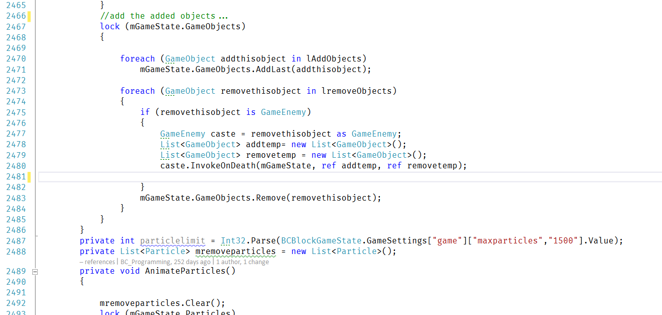
To demonstrate a few select Programming fonts I have encountered in my internet travels, I will use Visual Studio, and change the font, and take a screenshot of a small segment of code that I feel is “busy” enough.
System

Fig 1. A Typical System Font
Fig 1 shows this sample using the “System” Font. A few issues stick out for this font; first, it’s a tad too bold. It feels too “heavy” for use today, compared to other fonts. Also, it’s rather large; it takes up an unnecessary amount of space. For the most part, nobody uses the System font for… well, anything, actually.
FixedSys

Fig 2. FixedSys
Another “System” Font, FixedSys looks similar to System, but is different in a few ways. This font, shown in Fig. 2, differs so slightly from System; In fact, I can’t even see the differences, now. I did notice a change when I switched between System and FixedSys in the editor, though. Largely, whether one chooses System or FixedSys makes no difference; there are other, better fonts to choose from on any modern system.
Courier

Fig 3. Courier Font
Courier was another popular font at the time for programming, and other text-oriented tasks. Courier is basically the template “Typewriter” font. This brings the advantage (for most programming fonts) that it is monospaced. Typically, Courier is a “fixed” font. What this means, is that it isn’t scalable. This has good points and bad points; a good thing about this is that every font size is designed by hand; but the downside is, because of that there are usually fewer sizes to choose from. One issue with Courier is that the 0 (zero) and the O are quite similar, differing only in that the O is slightly thicker than the 0 (or the 0 is thinner than the O, depending on your perspective) This can make deciphering source code slightly more difficult. As does the similarities between the 1 (one) and l (lower case l); the number has a mere 3 pixels added on to what the l has! In an emergency, this font will do in a pinch, but I think it’s hour of glory has passed.
Courier New

Fig 3: Courier New
At some point, a newer, TrueType Courier font was created; being a TrueType font meant that the font could be resized to any size at all, on the fly. Engineers, however, were stuck on the name. A crack team of highly skilled engineers, literature professors, and English majors were assembled, and they worked, tirelessly, for weeks trying to think of a name that says both “Courier”, and “New”. Eventually, they made a breakthrough; the name for this new font? Courier New, as depicted above in Fig 3.
Courier New was the staple font for basic text editors and Programming tools on Windows for years. It carries over a lot of the flaws of it’s predecessor, such as having easily confused 0’s and zeroes. They even made the 1 (one) and lower-case L situation more difficult by making the net difference between them a single pixel. Overall, the font was nothing more than a true-typed version of it’s predecessor, which in and of itself was useful, since it allowed for using any size you could imagine. A contender appeared about the time of Windows 2000, This font, designed for the console, also makes a good Programming font, because it meets all the same requirements; Lucida Console.
Lucida Console

Fig 4:Lucida Console
Lucida Console was born from the marriage between a Typewriter and an insect called the 7-year Lucida, which every seven years emerges from it’s burrow and showers random passerby with luck it stored in it’s cocoon. Lucida Console was made fun of often in the schoolyard, being forced to play with fonts like Comic Sans. The font isn’t terrible, but, it makes the worst mistake possible for a programming font (which debatably it isn’t to begin with, judging from it’s name) this is that it makes the 0 (zero) and capital O look identical. 1 and lower-case l still look different, thankfully, but having O and zero looking the same for a programming font is sort of like running to a halloween party without a costume and then saying that you are dressed as Steve Ballmer when you notice how much you had sweat on the way there. That is, it doesn’t matter how cool you are or look otherwise, you are still sweaty and possibly sticky and are therefore in the eyes of other guests best avoided.
Consolas

Fig. 5:Consolas
With the release of Vista, Microsoft got MonoType to re-envision many fonts; Consolas is the monospaced font (out of many fonts) that resulted from this. Basically it is designed to replace Courier New. Additionally, Consolas is better tuned to take advantage of ClearType. Also, some of the mistakes of Courier New were resolved; the zero is now clearly a zero, signified with a slash. the one and lowercase-l are still a tad similar, but Braces ({}) are a bit more clear, as well. All around, probably my favourite programming font.
Inconsolata

Fig. 6:Inconsolata
Unfortunately, Consolas comes with Windows Vista; you can install it on XP, but since it is tuned for ClearType it doesn’t always look quite right on Linux. Thankfully, there is an alternative for Linux, called Inconsolata. However, the problem is that Inconsolata appears to be tuned for *nix font smoothing, and looks a bit funky on Windows (even with cleartype off), as you can see in Fig 6. Obviously this isn’t so bad since for the most part Inconsolata is an attempt to bring Consolas to the Linux desktop anyway.
Because, from my experience, you can’t seem to get Inconsolata working properly on Windows (I’m probably doing something wrong, though) The picture does not do it justice; for all intents and purposes, it is pretty much the same thing as Consolas. If you program on a Linux/BSD machine in a graphical environment, I would recommend this font highly.
Proggy Fonts

Fig 7: Proggy Clean
Inconsolata is a free font; It is, however, hardly the only one of it’s kind. Dozens upon dozens of free fonts are available, for any purpose, including writing source code. Some fonts go that extra step and are explicitly designed to be used for editing source code. One such font in that category are the Proggy Fonts. The Proggy fonts come in several varieties; but they all hold to one tenet: to be as readable as possible at small sizes. This is the sort of idea I can agree with! Just look at Fig 7. gorgeous… nice, clean lines… a bit small though, if you are using a high-resolution. I’ve set my text editors to use this font.
Anonymous

Fig 8: Anonymous
Anonymous is an interesting font, mostly because it’s name is so silly. For me it seems like a thinner, monospaced version of Helvetica Or Arial; but, it does use serifs on a handful of letters, such as Z’s, lower case L and 1. Anonymous crosses the zeroes, as well; making it easy to distinguish zeroes and the letter O. The slash extends outside the character itself, making it sort of look like a pictographic depiction of Uranus. Over all, another excellent font worth considering.
Envy Code R

Envy Code R
Envy Code R is another excellent programming font. The zeroes are slashed with a line that is more horizontal then usual, and the lowercase-L’s, ones, and I’s are all easily distinguished from one another. Another advantage is that the font scales rather well both to small sizes as well as large ones. The braces,brackets, and greater than and less than signs are all centered horizontally as well as vertically within the character box, which can be desirable. Like many of the other listed fonts, it appears to have pretty good support for unicode, as well.
Fira Code
Fira Code is another great Programming font. This one also features ligatures, which are where a font defines unique symbols for adjoining characters; in this case, they are customized for programming. for example, “>=” becomes ? (Mathematical greater than or equal to symbol), but doesn’t actually change your characters/text. Many other programming-oriented character groups have the same thing done to them, such as => becoming an arrow,== and === becoming connected parallel lines.
There are many other fonts- I may make revisions and/or post new entries for them as I collect them together and get appropriate screenshots.
Have something to say about this post? Comment!
4 thoughts on “A look at some Programming fonts”
I always stick with the simple fixedsys or system font. I don’t mind the lack of antialiasing.
Neither of those fonts is available on Linux, though, to be fair. And when it comes to the font used for text I’m going to be staring at and editing for hours at a time, I’m very picky :P. Consolas on Windows, and Liberation Mono on Linux. (The latter I believe is the default Monospace font for many distros)
For linux there is fixedsys in ttf: http://www.fixedsysexcelsior.com/
If you need bitmap font (for xterm and others..), I’ve not found a fixedsys copy. But there are VGA fonts, like this one: http://www.inp.nsk.su/~bolkhov/files/fonts/univga/
You’ll find more VGA bitmap fonts for X11, if you google a bit.
I prefer fixedsys for coding though, since it has less serif and is easier to read.
Btw, the first screenshot displaying System is not the VGA font, it’s Fixedsys, same as the fixedsys screenshot.
buteaful fonts,thank you~