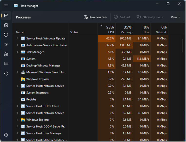
I recently noticed changes to Task Manager in Windows 11. Perhaps the systems I have Win11 on updated and this was the newest update. I don’t know. I don’t follow the news about this because I’ve yet to see a single good piece of information or new feature. Most of them just have the potential to piss me off in a “Why the hell would you do that?” way. This “redesigned Task Manager” certainly falls into that category for me. Perhaps I’m just getting stuck in my ways. I don’t know.
II feel like Desktop User Interface standards have been pretty well set in stone for decades and there seems to be this weird attempt to mix in Mobile App design UX elements into it and they simply don’t mesh.
Basically, they’ve removed the Tabstrip, with it’s clear, obvious labels, and replaced that with “sidebar” thing. Each “Tab” has a monotone, somewhat confusing icons, with no labels. Labels can be displayed by clicking the “hamburger button” at the top, or you can see them with a tooltip. Clicking a “Tab” shows no visual connection between the tab and the actual content to the right, like a Tabstrip does (selected tab is “connected” to the actual tab client area).
I feel there is absolutely nothing good about this design. it doesn’t make any sense to me. The “tab” buttons are now more difficult to identify, requiring one to either memorize where they are, what their incredibly basic and non-descript icons look like, or to waste time either hovering over the tabs to see what they are, or clicking around to figure out where they are. I’ve had to use it a few times and every single time I think I clicked on every single tab just to find the one I was looking for. It’s frankly silly.
“You’ll get used to it” people will say. Well yeah. If you live in an outhouse, eventually you can no longer smell it because you get used to the smell. Doesn’t mean you aren’t surrounded by shit, though.
The odd thing is that it doesn’t really save space. It just wastes users time. The tabs at the top of the older Task Manager
But there’s no reason for them to be hidden. It’s not even saving any space, because they’ve got header text and a weird new sort of Explorer Bar thing that provides shortcuts to some tasks which I doubt are used very often; This is taller than the TabStrip in previous implementations ever was!
It seems like this rework was not done with a goal of actually making Task Manager easier to use or more user friendly, but with the goal of simply making Task Manager “look modern”; where, of course, Modern is defined largely through design trends that have migrated from mobile operating systems.
The Sidebar hiding labels makes sense on say, Android. There isn’t space to show the labels. The *resolution* of the displays tends to be higher, but the physical size means that text has to be larger, so those items cannot be visible all the time or they will take up too much space.
But the metrics and the User Experience when using a desktop or laptop monitor is completely different. It doesn’t make and has never made any sense, in my opinion, for design stylings that arose in response to the limitations of Mobile device screens to appear in desktop operating systems. Even in the case of systems with a touch screen, the fact that the displays are physically much larger, in general, makes the “trade off” that many of the user interface elements from those systems make either entirely moot or sometimes deleterious, where “new” Apps use more physical screen space but actually present less information than a “traditional” Desktop application design.
Traditional Desktop Design builds on several decades of very careful UX research, and very precise decisions and concepts regarding making a user interface easy to use. There were even debates regarding Apple’s Mac OS and the later introduction of hierarchal pull down menus with regard to whether they were good or bad User Interface Design.
I’ve yet to see or hear of those sorts of discussions or information surrounding these new “Modern” app designs on desktop software. I have a feeling that as more and more people were not only more used to the design stylings of mobile apps and software, That is what is driving this unusual and arguably insane push for Desktop Applications to follow the same design trends, despite not being applicable.
It actually kind of reminds me when I first got my smartphone. I had a hell of a time coming to grips with the UX and was constantly annoyed and just wanted it to work “how I expect” which in many cases involved some aspect of Desktop UI design that simply would not work well on a phone. I think desktop applications- or rather “apps” and the design stylings that come with them are the result of the same desires in the opposite direction; People used to Mobile device user Interfaces who are out of their element in traditional desktop applications and therefore want desktop software to mimic how mobile devices work.
Have something to say about this post? Comment!

