As Windows 10 has evolved from it’s initial versions, and people have been exposed to UWP and Win32 alike, There has been a growing “movement” of people who have been calling for Windows to be more visually consistent. While at first look this sort of goal certainly seems sensible, Once you look more closely, it actually makes no sense at all. More importantly, Nobody actually wants this consistency they adamantly strive for!
The underlying catalyst for much of these complaints certainly has a base of truth. Fundamentally, people have noticed that UWP Apps and Win32 Apps have decided different “design languages”, And it follows that there should only be one.
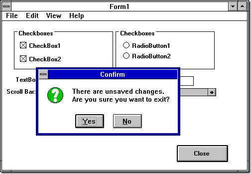
However, Win32 Apps themselves have never been particular compliant in terms of being a single “design language”. Windows has of course evolved over the years but we can even see multiple different design styles being used in Windows 3.1. By default, a Windows 3.1 Program might look like this:
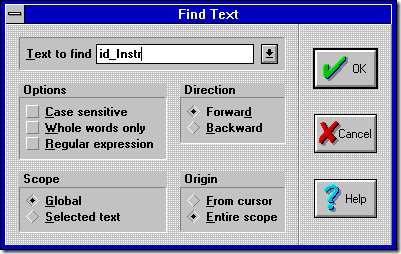
Everything there is more or less handled by Windows; the controls are drawn by Windows, with the checkbox and radio buttons for example being the only way Windows 3.1 actually knows how to present those controls. However, one doesn’t have to look far to find alternative stylings. BWCC, the Borland Windows Control Collection, was a commonly used set of components, particularly by developers using Borland tooling. Here is a Window using BWCC:
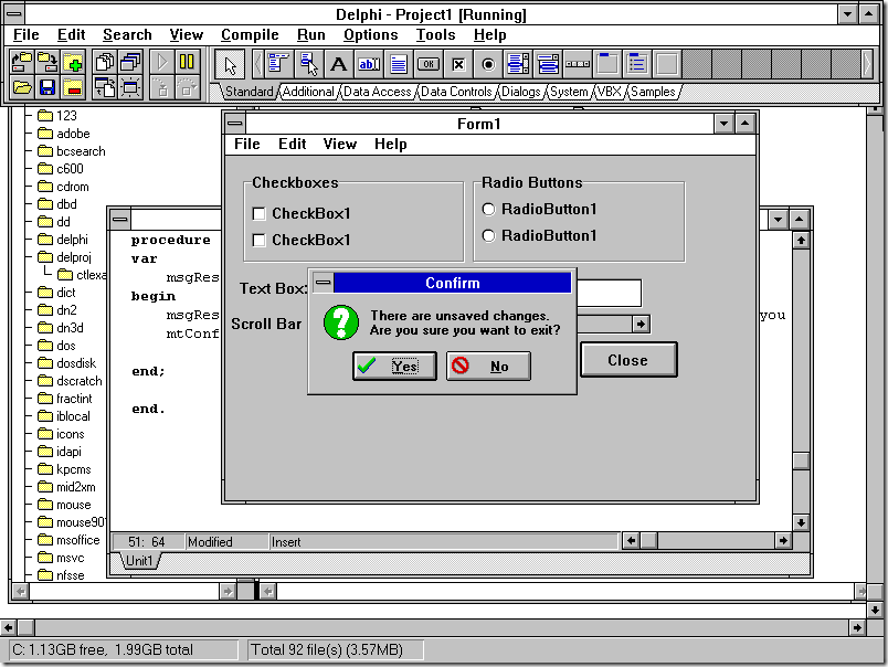
A lot of differences and a clearly different design style- Radio buttons are 3-D rhombuses with a dotted center instead of circles; Checkboxes are 3-D squares which get a checkmark inside when activated. Group boxes have a unique appearance, and The background is a curious gray/white dither. The dialog buttons also all have images. This is what a “modern” program liked like in the early 90’s, though. The 3-D appearance was all the rage, and it resulted in a sort of fractured appearance among Windows applications. Observe it’s successor, Delphi:
I’ve included the full screen capture in this one for a reason that I will swing back to that later, but what I’d like to focus on here is that the controls are completely different here; the checkboxes and radio buttons, group box, text box, and even the scrollbar have a “3-D” appearance and the background of the window itself is different to match that “3-D” appearance. The Messagebox also takes on a 3-D appearance, with a 3-D style for the title bar, as well as added images for the Yes and No buttons- It’s very much a completely different design, and it is definitely not consistent with the “Windows Default” appearance.
3-D was in some ways an early design trend. It was the “cool” thing to do in applications, to emulate the 3-D appearance across various controls. Things like the Borland Windows Control Collection were designed to fill that desire by users to have applications that “popped” more, with more colour and more visual presentation styling.
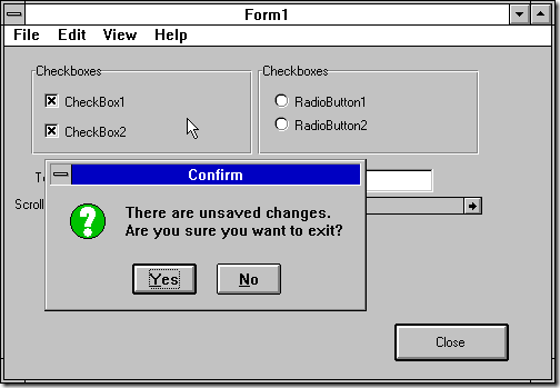
In fact as Microsoft geared up for Windows 95, which would indeed make that “3-D” trend a design standard, they started to incorporate 3-D into their applications. “CTL3D.DLL” was a DLL that provided the ability to provide a 3-D effect across many of the Windows default controls. This is in fact what is responsible for the visuals of the above Delphi application, which is perhaps a good indicator as it at least makes more applications “consistent” with one another and avoids the rather unusual visual design of BWCC dialogs/windows. The example I original provided “upgraded” to 3-D controls on Windows 3.1 looks something like this:
Late in the development of Windows 3.1 applications, there were examples like this where the designers would attempt to mimic the newer OS style. In this case, where Windows 3.1’s “Standard UX” had bold text, Windows 95 did not, so the programs don’t use it to model themselves after Windows 95. This trend more or less continues throughout the history of Windows; new versions of Windows come out with their own standards and programs end up using those on the older platforms to appear more “modern”- but, inconsistent.
My central point here is that Windows, and User Interfaces, have realistically never been consistent. Even today, while people are clamouring for Windows 10 to be “consistent” you see various “web apps” and even websites using wildly different paradigms. And the thing is that a lot of these are welcome changes for many. Visual and UI design that varies from the OS default seems to impress a lot of users- BWCC-based applications for example were well-received by many as “improving” the User Experience. Fundamentally, design trends tend to override the desire for applications to be visually and operationally consistent with one another. Developers ignore consistency in order to follow those trends and “look cool”- Aside from Borland’s BWCC, there were control sets created and provided by companies like Sheridan that predated CTL3D.DLL that had “3-D Controls” of their own (THREED.VBX, anyone?) which were yet another visual styling. Those defiant applications were the sort that got praise. it was applications that were designed to be consistent with the rest of the OS Platform that got mocked- they were boring and no fun now.
And that didn’t stop with Windows 3.1. Aside from those same applications then looking completely out of place on Windows 95 (we can brush that aside since the alternative really was that they just don’t run at all), Devs just kept going. Applications wanted to stand out and would have their own custom user interface skins, completely inconsistent with any other applications or even Windows itself. Seems to me like this whole thing about Microsoft not making Windows consistent is a bit late and a bit mistargeted. We’re talking decades of software defying UX guidelines and purposely being inconsistent with the rest of the OS and other applications, and people being just fine with it in general, but now we want to complain that some of the visuals of the elements that are part of Microsoft’s completely new User Interface Platform are inconsistent with what they had before. At least it being on a brand new platform is an excuse. What’s excuse do all those other inconsistent programs have? You’ve got Packaged Web Apps that lots of people use every day, like Discord, that by virtue of being web apps are completely inconsistent visually with each other and the OS they are running on, but it’s the UWP visual inconsistency we want to pick on?
Thing is, inconsistency is actually a good thing. It’s how you get new ways of doing things. I mentioned I would swing back to the Delphi screenshot, well, that is what is happening. At the top, notice how the toolbar has tabs underneath it? This lets you select from different toolbar sets. It’s one of many “UI Experiments” that actually works reasonably well to accomplish what it sets out to do. And experienced users may even recognize the concept, because the idea of having separate tabbed toolbars is fundamentally what the “Ribbon UI” introduced decades later in Office 2007 was all about. Some of those UI Experiments worked. Some did not. But even some of the ones that didn’t work were a lesson in what not to do, guiding those designing interfaces in later applications. pplications and application developers have constantly been screwing around and experimenting with their own distinct visual stylings, and making their own custom User interface widgets that you see nowhere else which otherwise duplicates behaviour in standard controls. It’s how we get new "standard" controls, really. But, even today, Way too many – IMO – applications still have their own custom skins on their Windows. If you want to call for UI consistency, let’s start with that, since that’s been going on for decades. The issues we could actually point at Microsoft are frankly a drop in the bucket.
Have something to say about this post? Comment!


