“Dark Mode” settings have started to be a big ticket concern for the last few years. Applications and Apps have started to add “Dark Mode” Visuals as an option, and more recently, Mac OS X (Now Mac OS, because that’s not confusing when you are interested in old software/hardware!) as well as Windows 10 have introduced their own “Dark Mode” featureset in the OS.
However, I’ve found Windows 10’s implementation confusing and actually a bit disturbing.
To explain, I’ll start at the beginning.
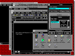
Graphical Environments in general have held to an idea that, for the most part, standard Graphical elements were managed by the OS. For example, on the Macintosh you would create software and it would use standard buttons, listboxes, etc. and the behaviour of those is handled by the OS. Your software didn’t have to handle detecting mouse clicks, drawing the button, changing it’s appearance when it’s clicked, etc. This concept was of course shared by Windows. on Windows 3.0 and 3.1, the system had “System Colors” that defined how different elements were drawn. Windows itself would use those colours where appropriate, for things like title bars and title bar font, and Applications could merely use the setting to use the current system setting. (And respond appropriately to the broadcast message when system settings are changed to deal with those colours changing). The system’s shipped with various “Themes” which were effectively sets of those colours, and you could customize those colours to your liking.
Up through to System 7, the Macintosh held fast to most of it’s original UI designs in terms of visuals. Originally grayscale, later support for colour did add little bits here and there, primarily for the icons, but the main User interface was largely white with black or gray lines, or with rather subtle colouring.
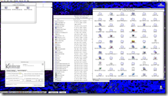
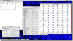
System 7 however, on capable systems, also added a new feature that was available as a downloadable add-on from Apple- Appearance Manager. This was effectively a “plugin” that would take over the task of drawing standard Elements, Elements were given a 3-D appearance; buttons “popped out” instead of being black chamferboxes. Progressbars got fancy gradients, and so on. This was part of the standard install with Mac OS 8 as well. These offered a lot of customization out of the box. Even more with software like Kaleidoscope. The standard appearance provided by the appearance manager was known as “Apple Platinum” and offered a number of colour options. (Mostly, the colours affected selection colour and the colour of progress bars, from what I can tell)
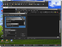
Not to be outdone, Windows 95 introduced 3-D theming to the Windows environment, providing a similar set of changes to the standard appearance. Unlike Appearance Manager, one could also set the “3-D Colour” which affected the colour of most elements. This facilitated the creation of what could be called “Dark” themes.
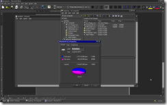
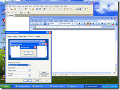
It wasn’t until Windows XP that Windows had a feature similar in concept to Mac OS’s Appearance manager, through the introduction of Visual Styles. Visual Styles worked in much the same way- a Visual Style defined custom images that were used to draw particular window elements, allowing a richer and more thematic styling to be applied. With Windows XP, in addition to the default Visual Style, there was also an Olive and Silver Theme/Visual Style that was included. A “Theme”, which previously was a set of system colours, was changed to also include the Visual Style option. Additionally, you could decide to disable Visual Styles and use the “Windows Classic” Theme, which would not use the “Luna” Windows decorator. Interestingly, With the classic Theme style, one could adjust the colour options in much the same way as one could on previous Windows releases, creating “Dark Mode” colour schemes if desired.
Around that same time frame, The Macintosh Operating System was migrated to OS X, something of a hybrid of the older Mac system and the NeXTStep Operating System. This introduced the concept of a “Composited desktop” to the mainstream. In a traditional desktop environment, it operates on a single output “image”. When you move a window, it get’s redrawn in the new location, and any revealed sections of the screen below need to be redrawn as well. A composited desktop keeps all that necessary information in memory- for example, it may hold the bitmaps that represent each window as a texture, and merely compose them together to create the final image, usually through the use of 3-D Accelerated Video hardware. With capable hardware, this approach was much faster and in general much cleaner. Internally, there was a framework for UI element drawing. However, externally, it was necessary to use third-party software to reskin the styles of the OS (Shapeshifter, for example).
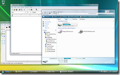
Windows Vista brought this same composited desktop experience to the Windows platform, this new technology was Aero. This underlying composited desktop experience has been used up through to Windows 10. Aero has similar capabilities to Luna, in that Visual Styles can customize almost every element of the system. “Aero Glass”, which many associated with Aero, was an enhancement to allow fancy affects to be done using the 3-D Rendering that is performed on the composited information. In it’s case, providing a sort of “translucent glass” effect which blurs the text behind the “glass” areas of a window (typically, the title bar).
Basically, over the years, there have been a number of solutions and options for a central, system controlled set of colours and repeated thematic elements such as buttons. Which of course is what brings me finally, to why I find Windows 10’s dark mode both confusing and disturbing- it leverages none of these technologies!
The Dark Mode feature of Windows 10 is implemented effectively as an on-off flag which does not change Windows behaviour. Instead, applications all need to check this flag and operate appropriately. the libraries behind UWP Apps will perform this check and change their visual theming appropriately. That is all. Win32 applications are unaffected. To implement Dark Mode in File Explorer, for example, Microsoft developers have changed File Explorer to see the flag and use different Dark colours for all UI elements if it does.
But it makes no sense. Every piece of Windows now needs to be altered to allow for this. And even if every part of Windows has these changes made to support it, Third party applications aren’t guaranteed to support it, either. Lastly, nothing about the Dark Mode support is standard- From an application perspective, if Dark mode is on, you cannot use the Visual Style- so what should a Button look like in dark mode? A Combo box scrollbar? etc. Even the colours have no standard- it’s all up to the application.
The implementation of Dark Mode makes no sense because it should have been a new Theme with appropriate dark colours that comes with Windows which also uses a new Visual Style that changes all the visual elements to have a darker colour. If Dark Mode is on, no application should see “white” for the Window background colour and be expected to disregard it if it seems Dark mode is on and use “A dark colour” of some sort that isn’t standardized for different elements.
Have something to say about this post? Comment!

