
BASeCamp Network Menu, which I wrote about previously, was a handy little tool for connecting to my VPN networks. It, however, had one disadvantage- It was clearly out of place- the style was “outdated” for the OS themes:
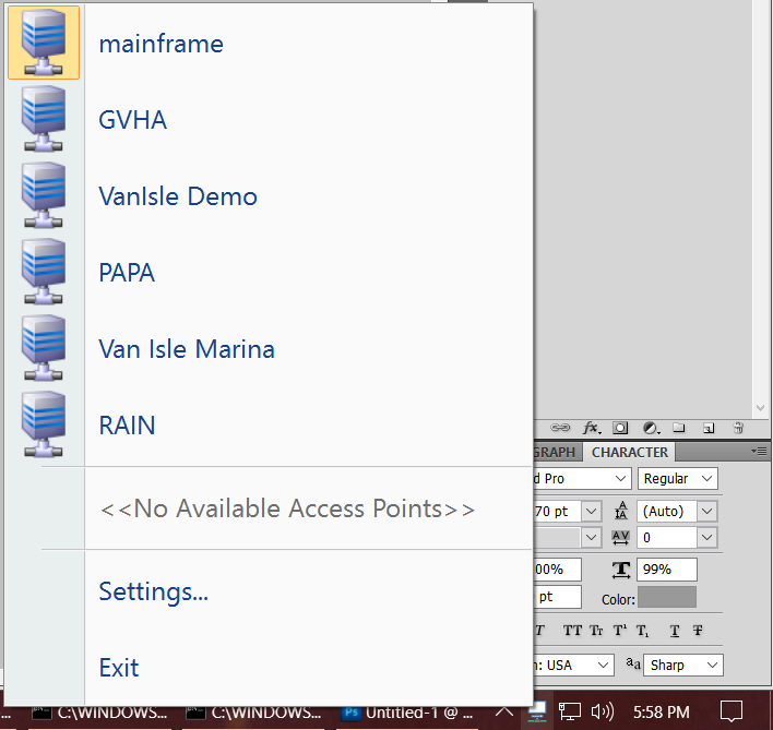
BCNetMenu displaying available VPN connections.
As we can see above, the style it uses is more like Office 2003, Windows XP, etc. Since the program is intended for Windows 10, that was a bit of a style issue, I think. Since none of the other Renderers really fit the bill, I set about writing my own “Win10” style menu foldout ToolStrip Renderer; Since the intent was merely to provide for drawing this menu, I’ve skipped certain features as a result to make it a bit easier.
Windows 10 uses an overwhelmingly “flat” style. This worked in my favour since that makes it fairly easy to draw using that style. Windows Forms- and thus the ContextMenuStrip one attaches to the NotifyIcon, allows overriding the standard drawing logic with a ToolStripRenderer implementation; so the first step was to create a class which I derived from the ToolStripSystemRenderer. This attempts to mimic the appearance of many Windows 10 foldouts by first drawing a dark background, then drawing a color over top. However- the color over top is where things were less clear. We want to use the Accent Color that is defined in the Windows Display Properties. How do we find that?
As it happens, dwmapi.dll has us covered. However, it bears warning that this is currently an undocumented function- we need to reference it by ordinal, and since it’s undocumented, it could be problematic when it comes to future compatibility. It’s very much a “use at your own risk” function:
|
1 2 |
[DllImport("dwmapi.dll", EntryPoint = "#127")] internal static extern void DwmGetColorizationParameters(ref DWMCOLORIZATIONPARAMS parms); |
This function uses DWMCOLORIZATIONPARAMS, which we of course, need to define:
|
1 2 3 4 5 6 7 8 9 10 |
public struct DWMCOLORIZATIONPARAMS { public uint ColorizationColor, ColorizationAfterglow, ColorizationColorBalance, ColorizationAfterglowBalance, ColorizationBlurBalance, ColorizationGlassReflectionIntensity, ColorizationOpaqueBlend; } |
Once defined, we can now create a helper method that will give us a straight-up color value:
|
1 2 3 4 5 6 7 8 9 10 11 |
private static Color GetWindowColorizationColor(bool opaque) { DWMCOLORIZATIONPARAMS parms = new DWMCOLORIZATIONPARAMS(); DWMNativeMethods.DwmGetColorizationParameters(ref parms); return Color.FromArgb( (byte) (opaque ? 255 : (parms.ColorizationColor >> 24) / 2), (byte) (parms.ColorizationColor >> 16), (byte) (parms.ColorizationColor >> 8), (byte) parms.ColorizationColor ); } |
We allow for an “Opaque” parameter to specify whether the caller wants the Alpha value or not; of course, t he caller could always do this itself but the entire point of functions is to reduce code so may as well put it in this way. it takes the 32-bit integer representing the color and splits it into it’s appropriate byte-sized components through shift operators, and uses those to construct an appropriate Color to return.
Using this color to paint over an opaque dark background (the color used with the Taskbar Right-click menu, for example) gives the following Menu, using the new WIndows 10 Renderer I created:
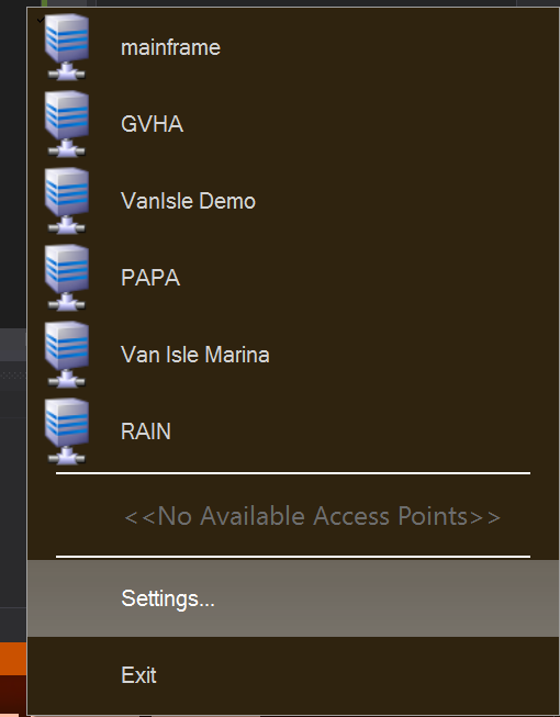
Not a bad representation, if I say so myself! Not perfect, mind you, but certainly fits better than the Professional ToolStrip Renderer, so I don’t think calling it a success would be entirely out of band. A more interesting problem presents itself, however- When configured in the display properties to have transparency effects,The default Windows 10 Network foldout has a “Blur” effect. How can we do the same thing?
After unsuccessful experiments with DwmExtendGlassIntoFrame and related functions, I eventually stumbled on the SetWindowCompositionAttribute(). This could be used to set an accent on a window directly- including, setting Blur Behind. Of course, as with any P/Invoke, one needs to prepare yourself for the magical journey with some declarations:
|
1 2 3 4 5 6 7 8 9 10 11 12 13 14 15 16 17 18 19 20 21 22 23 24 25 26 27 28 29 30 31 32 33 34 35 36 37 38 39 40 41 42 43 44 45 46 47 48 49 50 51 52 53 54 55 56 57 58 59 60 61 62 63 64 65 66 67 68 69 70 71 72 73 74 75 76 |
public static class DWMNativeMethods { [Flags] public enum DWM_BB { Enable = 1, BlurRegion = 2, TransitionMaximized = 4 } internal enum WindowCompositionAttribute { WCA_ACCENT_POLICY = 19 } internal enum AccentState { ACCENT_DISABLED = 0, ACCENT_ENABLE_GRADIENT = 1, ACCENT_ENABLE_TRANSPARENTGRADIENT = 2, ACCENT_ENABLE_BLURBEHIND = 3, ACCENT_INVALID_STATE = 4 } [StructLayout(LayoutKind.Sequential)] internal struct AccentPolicy { public AccentState AccentState; public int AccentFlags; public int GradientColor; public int AnimationId; } [DllImport("user32.dll")] private static extern int SetWindowCompositionAttribute(IntPtr hwnd, ref WindowCompositionAttributeData data); [DllImport("dwmapi.dll", EntryPoint = "#127")] internal static extern void DwmGetColorizationParameters(ref DWMCOLORIZATIONPARAMS parms); public static void EnableBlur(IntPtr WindowHandle, bool pEnable=true) { var accent = new AccentPolicy(); var accentStructSize = Marshal.SizeOf(accent); accent.AccentState = pEnable ? AccentState.ACCENT_ENABLE_BLURBEHIND : AccentState.ACCENT_DISABLED; var accentPtr = Marshal.AllocHGlobal(accentStructSize); Marshal.StructureToPtr(accent, accentPtr, false); var data = new WindowCompositionAttributeData(); data.Attribute = WindowCompositionAttribute.WCA_ACCENT_POLICY; data.SizeOfData = accentStructSize; data.Data = accentPtr; SetWindowCompositionAttribute(WindowHandle, ref data); Marshal.FreeHGlobal(accentPtr); } [StructLayout(LayoutKind.Sequential)] internal struct WindowCompositionAttributeData { public WindowCompositionAttribute Attribute; public IntPtr Data; public int SizeOfData; } } public struct DWMCOLORIZATIONPARAMS { public uint ColorizationColor, ColorizationAfterglow, ColorizationColorBalance, ColorizationAfterglowBalance, ColorizationBlurBalance, ColorizationGlassReflectionIntensity, ColorizationOpaqueBlend; } } |
If the Blur setting is enabled, then the EnableBlur function is called to enable blur; otherwise, to disable blur. In both cases, it tosses in the Handle of the ToolStrip that is opening, which, apparently, is the Window handle to the actual menu’s “Window”, so it actually works as intended:
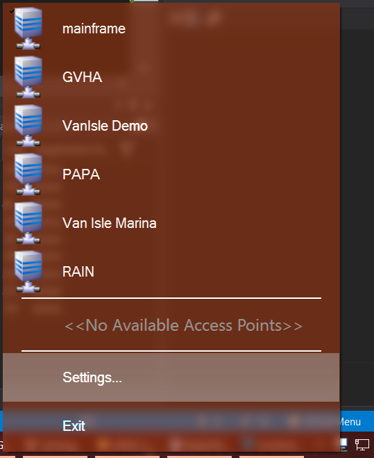
I also found that darker colours being drawn seemed to be “more” transparent. Best I could determine was that there is some kind of transclucency key; the closer to black, the more “clear” the glass appears. References I found suggest that SetLayeredWindowAttributes() could be used to adjust the colour key, but I wasn’t able to get it to work as I intended; Since the main effect is that the “Disabled” text, which is gray, appears like more “clear” glass within the coloured blurred menu, I found it to be fine.
It will still be ideal to write additional custom draw routines in order to allow checked/selected items in the listing to be more apparent. As it stands the default “Check” draw routine appears more like an overlay on the top left of the icon, but it’s easy to miss; it would be better to custom draw the items entirely, and instead of a checkmark perhaps highlight the Icon in some fashion to indicate selection.
Have something to say about this post? Comment!