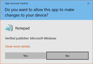
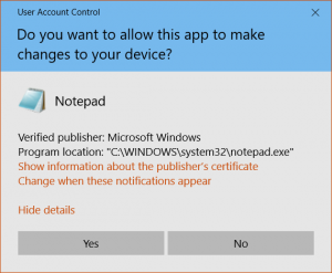
User Account Control, or UAC, was a feature introduced to Windows in Windows Vista. With earlier versions of Windows, the default user accounts had full administrative privileges, which meant that any program you launched also had full administrator privileges. The introduction of UAC was an attempt to solve the various issues with running Windows under a Limited User Account to make the more advanced security features of Windows far more accessible to the average user. The effective idea was that when you logged in your security token, which was effectively “given” to any software you launched, would be stripped of admin privileges. In order for a process to get the full token, it would require consent, this consent was implemented via the UAC dialog, allowing users to decide whether or not to give or deny that full security token.
It was a feature that was not well received; users complained that Vista was restricting them, and making them ask for permission for everything- something of a misinterpretation of the feature and how it works, but an understandable one somewhat. Nowadays, it is practically a staple of Windows, being present in the default user accounts through 7, 8, and now 10. Even so, it has had some design changes over the years.
One interesting aspect of the UAC consent dialog is that it will differentiate between a “Verified”, or signed, executable, and an unsigned one, displaying slightly different designs based on the evaluation of the executable. A signed executable effectively includes a digital signature which is able to verify that the program has not been altered by a third party- so if you trust the certificate authority as well as the publisher, it should be safe.
Windows Vista
We start our tour, perhaps unsurprisingly, with Vista.
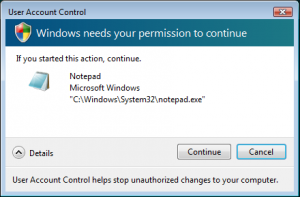
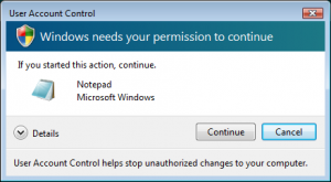
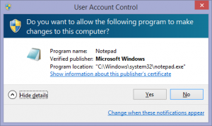
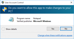
Vista UAC Dialog, shown for an executable with a verified signature, after expanding the Details option.
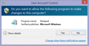
When the executable is verified, we see a relatively straightforward request. Expanding the dialog, as shown in the second image, provides access to the application path; There is no way, within the UAC dialog, to inspect the publisher’s certificate- that needs to be checked via other means.
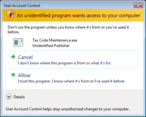
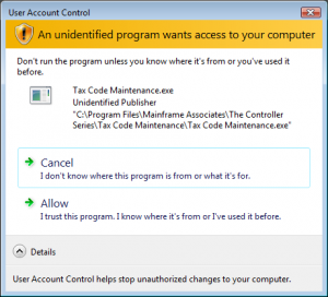
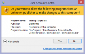
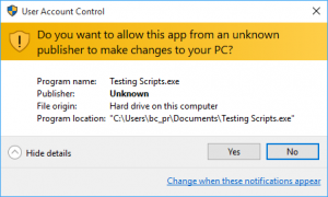
Interestingly, once we start looking at unverified executables, however, we see quite a different presentation:
Rather than the more subdued appearance as seen when the application is verified, the dialog displayed for an unverified application is more bold; the options are presented as TaskDialog buttons, and the entire dialog has a very “Task Dialog” feel; additionally, the colour scheme uses a more bold yellow. Interestingly, Expanding the “Details” really only adds in the file location to the upper information region. Kind of an odd choice, particularly since the UAC dialog will usually be on it’s own secure desktop and thus screen real-estate is not as valuable as it might otherwise be.
Windows 7
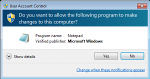
On Vista, elevation tended to be required more frequently and thus UAC dialogs were rather common for standard Windows operations. Users needed to give consent for many standard Windows tasks such as adjusting Windows settings. Windows 7 adjusted some of the default behaviour and it does not by default present consent dialogs for many built-in Windows operations. The design of the UAC dialog also was adjusted slightly:
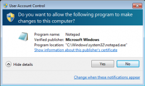
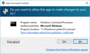
For verified executables, the dialog is rather unchanged; The biggest changes we see are in the title copy “Windows needs your permission to continue” changes to an ask regarding whether the user gives permission to a particular program. The dialog now includes a hyperlink in the lower-right that takes you right to the UAC settings, and publisher certificate information is now available when the details are expanded.
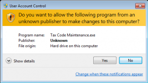
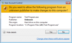
The Unverified dialog is quite a departure from the Vista version. It takes it’s design largely from the “Signed” version of the same dialog; perhaps for consistency. It dumps the “TaskDialog” style presentation of the options, instead using standard Dialog buttons, as with the “Signed” Appearance.
Windows 8
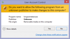
For the sake of completeness, I’ve presented the same dialogs as seen on Windows 8. There have been no changes that I can see since Windows 7, excepting of course that the Win8 Windows Decorator is different.
Windows 10
Yet again, included for completeness, the UAC dialogs shown by Windows 10 in the November Update. These are again identical to the Windows 8 and Windows 7 version of the same, providing the same information.
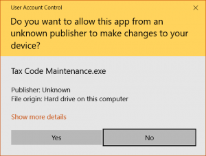
This all leads into the reason I made this post- the Anniversary Update to Windows 10 modified the appearance of the User Account Control dialogs to better fit with UWP standards:
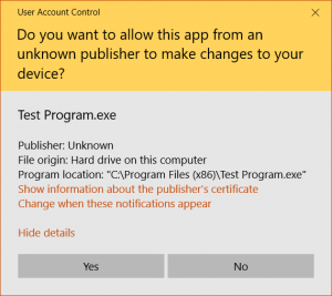
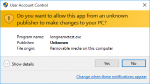
Windows 10 Anniversary Update UAC dialog for an unverified Executable, after pressing “Show Details”.
As we can see, the Windows 10 Anniversary Update significantly revised the UAC dialog. It appears that the intent was to better integrate the “Modern” User Interface aesthetic present in Windows 10. However, as we can see, the result is a bit of a mess; the hyperlink to display certificate information appears for unverified executables, but in that case, clicking it literally does nothing. The information is presented as a jumble of information with no text alignment, whereas previously the fields were well defined and laid out. I’m of the mind that updating the dialog to UWP should have brought forward more elements from the original, particularly the information layout; The “Details” hyperlink in particular should be more clearly designated as an expander, since as it is it violates both Win32 and UWP Platform UI guidelines regarding Link Label controls. I find it unfortunate that parsing the information presented in the dialog has been made more difficult than it was previously, and hope that future updates can iterate on this design to not only meet the usability of the previous version, but exceed it.
Have something to say about this post? Comment!

