
The Run dialog is an unassuming little dialog. It has stuck around through thick and thin. It was there for the best of times, and it was there for the worst of times, and so on. it hasn’t changed much since it was added. Here’s a look at some of the Windows Run Dialogs through the OS versions. We’ll start with Windows 3.1 because that is the most convenient for me.
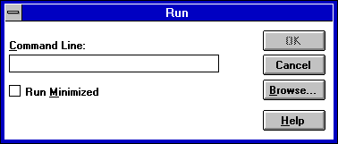
The Windows 3.1 Run dialog. it was used for Running things, surprisingly.
It looks very similar to the Run dialog today. The one exception is that back in those days Toast was very popular, so in order to appeal to the masses Microsoft stuck a toaster slot in the upper left-hand corner. Realistically, of course, the reason was because it needed ot use an image that could be recognized by simply inverting it, since they needed to support monochrome displays and this way the control box could simply have it’s image inverted.
The Windows 95 Run dialog. Look at those fancy 3D effects, huh? you drooling yet?
Windows 95’s big feature was the start menu. Another feature was that it made Window elements and controls more 3-D An interesting addition here is the combobox in place of a standard textbox; we cannot give Windows 3.1 the credit here, as this was added in Windows NT. Unfortunately my Windows NT 3.51 Virtual Machine won’t start, so I present you instead with this artists rendition of what it looked like:
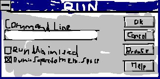
Artists rendition of the Windows 3.51 RUN Menu. Prints are available for personal appreciation of this art piece.
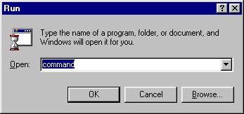
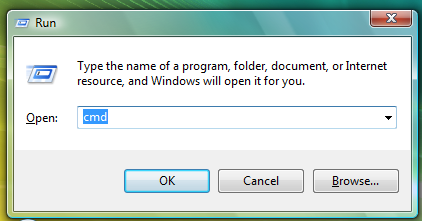
Windows NT4 Run dialog.
The artists behind the design of Windows NT4- or rather, the Windows 3.51 Desktop Shell update, were careful colour pickers. As we can see here they chose a teal colour. This was used to represent the emptiness of the common man. Additionally, the “Run in separate memory space” option was always grayed out inexplicably to represent the futility of wanting to make decisions.
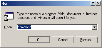
The Windows 98SE Run dialog. Notice the gradient in the titlebar. Totally worth the upgrade.
I’m running out of things to say here. This is the same dialog, what can I say? They added gradient titlebars, I suppose.
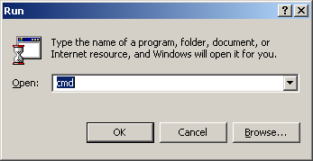
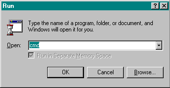
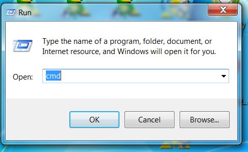
Windows 2000 Run dialog
The Windows 2000 Run dialog. It removes the “Separate memory space” option. Probably because it didn’t make sense to have a disabled checkbox sitting there. I wasn’t able to get the Windows NT4 checkbox to enable, I even tried asking nicely.
Windows ME run dialog
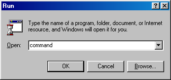
Windows ME is much maligned. For good reason; When MS decided to make ME they had already shelved the 9x codebase and went forward with NT4 and the next version of Windows intended to bring NT to the consumer. “What transpired to change their mind” you ask, between mouthfuls of thick gruel, because everybody loves a good bowl of gruel. (A shame there is no such thing, though). ME got the distinct honour of being Windows 9x but pretending to not be. For example, it disabled the “Restart in MS-DOS mode” option just to make it seem more complete and self-contained; it changed the default theme to be more like Windows 2000, which released before it. etc. By and large it is just Windows 98SE with some extra stuff stapled on, but if you had the choice between Windows 98SE and ME, you should shoot yourself go with Win98SE.
The Windows XP run dialog.
Remember how I mentioned that the art/theme designers were really careful with colours? well, before XP was released they were all fired and replaced with a band of clowns, who came up with this theme. the theme engine wasn’t bad; one of the developers loved a certain chocolate bar, (Luna bars) and called it “Luna” I base this off of me making that fact up right now. Other than the colourful playpen appearance of the default theme (Silver and Olive were OK, though Royale Noir was my favourite, though not officially included).
Windows Vista Run dialog
Windows Vista dumped Luna in preference to a new Composited desktop manager with a new theme. This new theme was called Aero, again, totally after the chocolate bar, and not at all a fact a invented.
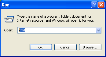
Windows 7 Run Dialog
The Windows 7 Run dialog was found in Windows 7. It looks pretty much the same as the Vista dialog. In this case the Win7 system this screenshot was taken on had a higher DPI so the UI components are at a higher resolution. Otherwise quite straightforward.
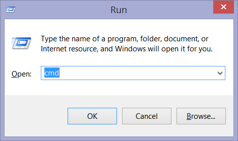
Windows 8.1 Run dialog
Windows 8 and 8.1 are much maligned and even compared to Vista and ME. The reasons I can only fathom as being due to these people being idiots or possible dullards. Another theory involves a lot of chicken soup and something about A Nazi Elmo. We do see that the theme is different. While it still uses the compositing engine it dumped the overly flashy “OMFG I CAN SEE THROUGH WINDOWS” eye candy for something that actually took UI design into account.
Windows 10 Run Dialog
Finally, we come to the Run dialog in the Windows 10 tech preview. This version seems to remove all the borders from windows for some reason; or at least makes them only 1 px. I don’t like that revision myself, I suspect it was to make Store apps be more consistent with other program windows.
And that is my ridiculously uninformative summary of the Run dialog throughout Windows versions.
Have something to say about this post? Comment!