With Windows 8s changes, in particular to things such as the Start Button and Start Menu, have raised a flurry of criticisms. This series of articles will go through the process by which various Windows Operating Systems display your applications and how Applications are launched, as well as technical and possible design motivations.
Windows 3.1 marked the beginning of a long line of Operating System success. It did, however, have it’s share of problems; one of those was it’s reliance on MS-DOS. It was not a Full operating system, but rather a desktop shell. it also lacked a lot of the integrated features found in Other operating systems that had a UI.
Windows 95 marked a re-imagining in how we use computers. Between the release of Windows 3.1 and the August 1995 release of Windows 95, the developers and designers were trying to improve the user experience across the board.
Windows 95 brings forward “3-D” controls. With Windows 3.1, the default Checkbox, Textbox, Radio Buttons, and similar controls consisted primarily of black lines. a textBox, for example, was literally just a black outline. Windows 95 changed this and gave all window elements and menus a distinct 3-D appearance. Windows 3.1 applications did have a number of libraries that were used to create “3-D” controls. these controls were within a common dll, “ctl3d.dll”.
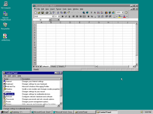
One large change was the change to the desktop. In Windows 3.1, Applications minimized to icons on the desktop; in a technical sense this actually just changed the ‘state’ of the window but the icon was still drawn by the program using standard graphics operations. Most Applications just deferred to the Default Window Procedure, which simply drew the icon. Windows 95changed the desktop- the icons on our desktop’s today still follow this model set forth by Windows 95, which allows documents and shortcuts to be placed directly on the desktop. Instead of applications being displayed as icons when minimized, they were moved to the new Taskbar, additionally, the window state of the program did not change whether the taskbar button was visible or not. Instead, all applications stay on the taskbar, making it a very easy way to switch between applications.

The Windows 95 Desktop. All open windows appear on the taskbar, though some of the windows are not visible. Also note that the resolution of 1024×768 was super-high resolution at the time. Most computers running Windows 95 ran at 800×600.
At the time, this was met with some negativity- the extra graphics operations, it was argued, would cause a significant loss in performance. The concerns of course were not entirely unfounded- underpowered machines could in fact have a negative performance impact by running Windows 95, however this is true for any OS release, and systems with capable 2-D graphics acceleration were practically unaffected.
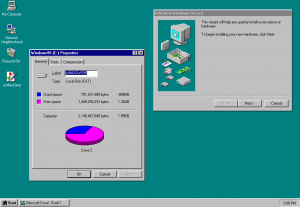
The new User Interface improvements extended quite far. Many de-facto, common arrangements of UI elements in Applications were made standard; Things such as Property Sheets and step-by-step operations became core components available through the OS and used by it as well.
‘Wizards’ were step by step programs that guided the user through a specified task, such as (in the above case) installing a new hardware device, or adding a new printer or User or any number of things. These are still common today and there is in fact a design guide for creating new wizards in applications.
‘Shortcuts’ were introduced in Windows 95. in Windows 3.1, the closest thing to a shortcut was a Program Icon in Program Manager. Shortcuts expanded on the capabilities of those Program Icons by making them actual files that could be stored anywhere. You could put a shortcut in your documents menu, or on a floppy disk pointing at something on your hard drive. OF course shortcuts were only valid as long as their target existed, but they made it easier to arrange and sort things. You could have a shortcut to a program or Document in multiple locations.
The Taskbar was introduced with Windows 95, of course; and is one of the most long-lived OS Features still in common use today. It reimagined Windows 3.1’s Desktop. Windows 3.1, essentially, showed all Applications running as Icons. the Windows 95 approach revised this and displayed all running applications as taskbar buttons on the start menu- this had the advantage that the start menu was always visible, so you could always switch directly to applications you wanted. With 3.1 you had to minimize your application and get access to your desktop to see the other applications, of which Program Manager was one. Windows 95 also changed the standard Window decoration to that which we are mostly familiar with today; the common Minimize, Maximize/Restore, and Close buttons replaced Windows 3.1’s Minimize, Maximize/Restore, and Control Menu Buttons, which had a different appearance (The “Control Menu” was more like a top-view of a toaster, and it was “special” in that it actually inverted rather than “pressing in” like other buttons. ).
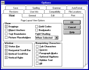
The best way to demonstrate these visual changes is, of course, to show them. Microsoft Word provides a Tools->Options menu item that presents a options dialog. while the layout changes between Word 6.0 and Word 97, it still provides a reasonable basis to see the visual differences between the underlying Operating Systems.
Even today one can almost understand the logic; the shading and 3-D effects are basically entirely visual, and don’t actually provide a positive usability benefit. At the same time, however, they look nice, and they don’t have a big negative impact. Being able to use a nice-looking system can often benefit productivity in and of itself.
One of the more interesting capabilities of Windows 95 is it’s ability to allow you to give long names to files. This was referred to as “Long filename support”. This is interesting because it overcomes file system limitations in a very clever way to provide a feature. In this case, it circumvents the FAT file systems 8.3 name limitation by actually creating separate directory entries that have a myriad of attributes (including being labelled as volumes and directories) to avoid other programs fiddling with them. It has a few other features for safety (particularly for the case where yo drop to DOS, delete a file, and then have extra VFAT directory entries that might be associated with the wrong file). It is, of course, more of a workaround but it works well and is very nearly transparent to the typical user.
Windows 95 came in several revisions. The later release, referred to as “OSR2” or sometimes “Windows 95B”, provided better USB support akin to what was eventually provided with Windows 98, as well as support for the new FAT32 file system. This support didn’t really help since manufacturers didn’t support Windows 95.
Legal troubles
Windows 95 was also the icebreaker that got Microsoft into some legal trouble in the 90’s. Many Editions of WIndows 95 included Internet Explorer. At the time, Internet Explorer was being offered for free by Microsoft; it was included in Windows. This was a problem for companies like Netscape, who up until that time had done well charging for a barely functional browser with a hodgepodge of pointless features, and then Microsoft came into the picture and made a browser that wasn’t garbage. The nerve. Windows 95 itself also came under fire from Caldera, who had recently purchased DR-DOS for their Linux distribution and somehow saw necessary to then raise litigation that DR-DOS could not be used to run Windows 95. In my opinion a lot of the flak, both legally and otherwise, towards Microsoft and their business practices seem to be spearheaded by individuals who had their own business ventures damaged. Gary Kildall and Digital Research are a good example of this. Their products were reasonable but Microsoft commoditized the market for System software; there was no reason to purchase an expensive copy of CP/M when a copy of DOS was the same, if not better, at almost everything. Add to this the fact that IBM had originally approached Digital Research for an OS for the IBM PC, and it was DR’s contract disputes that caused IBM to look elsewhere, and eventually towards Microsoft. This bitterment is continued in almost all major detractors, and it is something that is difficult to ignore. Bias and confirmation bias can be exceedingly strong; there were some Sun Microsystems employees who said people should bill Microsoft for their wasted time when their systems stop working correctly; the Irony being that they themselves were billing the owners of Solaris systems for contractual support and maintenance.
Windows 95 brought us forward to the modern Win32 Programming environment as well. Win32 is an interesting case since technically it was already available in NT 3.1; however Windows 95 itself added a myriad of Shell capabilities that expanded the existing API set. Windows 95 was the first step towards bringing consumers to that modern, 32-bit protected mode operating System that was first imagined with OS/2 and realized in NT and OS/2. Compatibility constraints prevented a clean switch directly, and it would be a long road but we did get there eventually.
Have something to say about this post? Comment!


