I made a new wallpaper. This one is simpler than some of my others, but I think that suits it well.
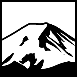
The tricky part was the logo. All I could find were the relatively small versions visible in some of the existing logos and headers.
I did find a slightly larger version in a tutorial of some sort being used as an example; I was able to take that small image, delete the white portion, applied a 100% black colour overlay, and used Illustrator to “trace bitmap”; then saved that as an EPS, opened that back in Photoshop with a high resolution, and used that image in a two-layered approach with different bevel settings to approximate what the logo might look like at a higher resolution. It looked a bit bland, so I also used a mask to block out part of the text of 1’s and 0’s.
Since I’m here, may as well plonk out a few other wallpapers I made.
Space & Science
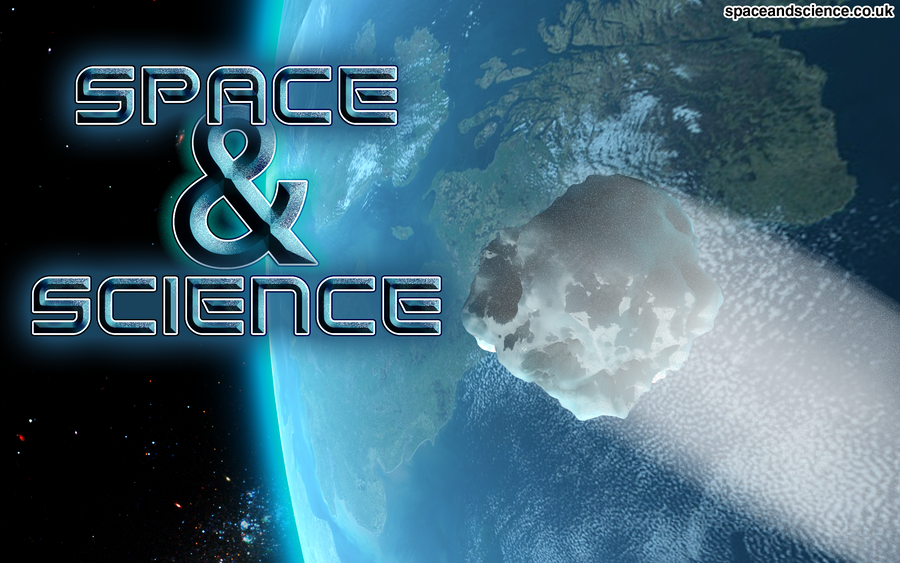
This one was made for spaceandscience.co.uk:
This one was a gigantic pain. I managed to get a nice asteroid mesh by doing some funky noise and smoothing and stuff on a sphere with a bajillion (give or take a few) different faces. The comet trail is sort of a cheat though. I rendered the 3ds max image twice: one with only the asteroid visible, and one with everything else. I used the one with only the asteroid, applied a color overlay of white, merged it with an empty layer to rasterize the overlay, and then used a motion blur in the desired direction. Plopped over top of the original asteroid image, and then the “everything but the asteroid” render, and there it was. (I did some additional tweaking, such as making a third layer with the motion blur and messing with dissolve to try to make “ice particles”, or the appearance thereof) I had to add the text too, but that was pretty much the easy part. Another piece of trivia that might not be immediately obvious: the Earth is showing only the UK. Thought that was pretty cool.
BaseCamp Programming
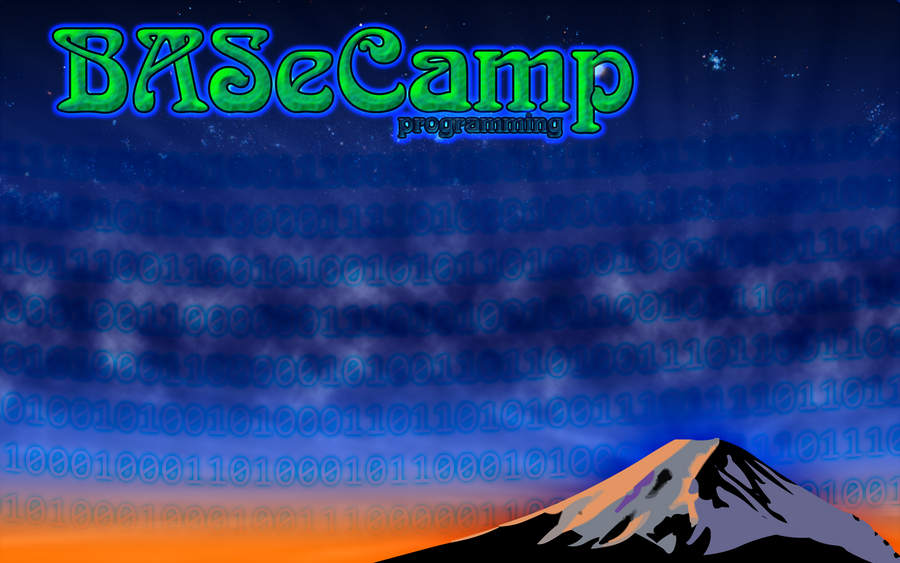
And of course I had to make one for myself at some point!
Not much to say for this one. I did have to re-create the mountain logo at a higher resolution, which I managed to do the same way I did in the CH wallpaper (although I did mine first, having only made the CH one a few hours ago…). Basically trace in Illustrator, save as EPS, import, and profit. I use the binary 1’s and 0’s here too. (side note: I didn’t type the 1’s and zeroes, I wrote a quick C# program to do it for me:
|
1 2 3 4 5 6 7 8 9 10 11 12 13 14 15 16 17 18 19 20 21 22 23 24 25 |
using System; using System.Text; public class Genbinary { private const int numchars=140; private const int numrows = 80; public static void Main(String[] args) { StringBuilder sb = new StringBuilder(); Random rg = new Random(); for(int line =0;line<numrows ;line++) { for(int i=0;i<numchars;i++) { sb.Append(rg.Next()%2==0?"1":"0"); } sb.Append("\n"); } String result = sb.ToString(); Console.WriteLine(result); } } |
compiled that straight at the command line, used genbinary > bin.txt, opened bin.txt in Editpad 7 (A program I should possibly write a review of) and then pasted it into the text object in Photoshop. (the const values are what I used for the CH 1’s and 0’s; I used smaller values for the BC Wallpaper).
I made over 100 other wallpapers but they are mostly MLP (there are a few star trek ones, too). If I was to write out the details of how I made them all I’d be typing for days! So I chose this subset.
I also made a wallpaper for GlitchPC.net but that’s another bag of oysters…
Have something to say about this post? Comment!


